


|
|
|
|
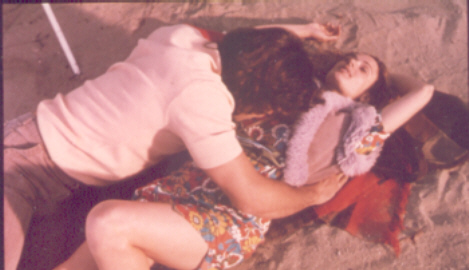
Although CHANNELLING baby deals with human emotions that are the same for people everywhere, the film should give international audiences a window into another culture. Historical events such as the Vietnam War are seen from a very New Zealand perspective: "A lot of other countries had their own experiences of that war," comments Parker, "but this is ours." "Our soldiers came home and made no public comment on the war, unlike in the USA," adds De Nave. "Vietnam Vets in America took to the streets, went to politicians and generally made their opinions on the war very clear. In New Zealand we have only recently publicly acknowledged our Vietnam Veterans." "As a nation, we are only just beginning to confront our emotions relating to that period and about other historical issues," says Parker. "One of the themes of the film is about uncovering the truth of the past in order to move forward in the present." "Even on the most superficial level our Vietnam experience was different," Parker continues. "For example, in our film the New Zealand soldiers aren’t all young conscripts, they don’t have very short haircuts and they wear different hats. Most of us, even in New Zealand, have only seen the American version in films." A conscious effort was made by all involved to ensure they got the facts straight. "Kevin found out everything he could about New Zealander’s who went to Vietnam," adds Parker. "And of course the wardrobe and design team were very meticulous about accuracy." The production visited the local RSA (Returned Servicemens’ Association) and met with several Vietnam veterans. Consequently BAS NISSEN, a decorated Vietnam veteran, became an advisor on the film. "His job in the army was the same as Kevin’s character’s and his input was incredibly useful," says Parker. "Bas knew all the technical details, but he and others also gave us lots of insights into the sort of feelings Geoff might have had after being there." She feels the settings and the period will definitely resonate for local audiences. "In the late ‘90’s most people going to the movies were either children or young adults in the ‘70’s. It’s a period that many of us reflect on."
The story, however, defined certain parameters. The look of the film had to be "related to what it’s about. It was important that we didn’t get carried away with being too stylish about the ‘70’s. What we see in the film is to do with the characters’ stories and their emotions rather than too much focus on the period". "If this show was to look too ‘70’s, it would have been over designed", agrees Production Designer BRETT SCHWIETERS. Ironically on this occasion he found that budget constraints actually helped to refine design considerations: "We didn’t have a hell of lot of money so it was very important that the limited pieces we chose were the right ones." "However, one of the exciting things about doing a period piece, especially the ‘70’s is that you can really go to town with some things," he continues. "One of the more interesting things we had to find for this film were a hippie’s combie van. That was a lot of fun. We found an old VW and painted it up with love and peace symbols. There were butterflies on the front, flowers on the wheels. It looked really fantastic!" The ‘90’s scenes in the film have a more restrained look with most of the action occurring indoors. "We tried to evoke the feeling that time had passed by; aging the wallpapers and importing a few new props that would say that the ‘90’s had moved in," Schwieters explains. The Designer derived much satisfaction from CHANNELLING baby's script and a mutually cooperative production process. "It’s very fulfilling working on a project that has such story potential because the script is so comprehensive at the outset," he says. "And Christine has that marvelous capacity to understand where a person is coming from and act on it. She allows you to go beyond what you’ve agreed with her and takes you to something that’s your own." Collaborating with Schwieters on the look of the film, was Wardrobe Designer KIRSTY CAMERON, who brought a range of references together for the time periods in the story. "It took constant communication, elimination, inspection, referencing, scouring the NZ Women’s Weekly back catalogue and being inspired by lots of photographs from 1970’s magazines," she explains. Cameron sees the film as having a uniquely "New Zealand look as opposed to Haight Ashbury or Carnaby Street, London. It needed to be a little bit grimy, a little bit flatter, with a certain urban chic." "Kirsty has a very strong sense of design and style," says Writer/ Director Christine Parker. "I think that’s partly to do with the fact that her background is not just wardrobe design – she’s an artist and film-maker herself. She’s also very aware that the actors must feel beautiful as well as be in character. They have to be funky, whilst not losing the connection to the overall design concept." Comments Producer Caterina De Nave: "The trick to period design is not to make it stand out so that the audience’s eye is drawn away from the emotion of the story. Kirsty achieved that and did the most incredible job." It was also important to "keep a continuity of character," says Cameron. "Bunnie and Geoff both age over twenty years in the film." "There’s a very fine line between making them younger or older because they’re still very much the same person," notes Parker. "And they don’t get that old, so we couldn’t resort to obvious tricks." The ‘youthing’ of the characters in CHANNELLING baby involved a multifaceted approach. Complimenting the design team was Make-up Supervisor DENISE KUM. "I worked very closely with Kirsty, Christine and Brett to find a basic sense of what we were trying to convey," she explains. "And we just expanded on what the actors brought to their characters, rather than superimpose a look on top of them." "Denise is very thorough about research and getting the period look and details right", says Parker. "I’ve worked with her a lot in the past. She’s so creative and she really understands the needs of the actors and the story." "Danielle’s character Bunnie had very long hair in the ‘70’s scenes which gave her a slightly afro-ish feel," says Kum. "With Kevin’s character, Geoff, we wanted something that was a bit Bee Gees. Something quite fun, quite different from how Kevin usually looks." Aging the actors was essentially created by "working with what was there and adding different types of emulsion, special face packs and luminescent, light reflective foundation," explains Kum. Basic things like how the hair frames the face. Then in the ‘90’s, greying them up a bit, taking a bit of skin colour out." "I was concerned at the start because I didn't think they could get the light powerful enough to make me look like a twenty year old," laughs actor Kevin Smith. "They used this collagen based stuff designed by a guy who does make-up for Cher and Michelle Pfieffer (and in the film you'll see I look like both of them!). It fills up all the blood vessels under the skin and brings them to the surface. But it’s like the muscle liniment, 'Deep Heat'. You put that on your face for the first time and phowwoo, it’s like someone’s inflating your head. It doesn't take the wrinkles away it just inflates your head to fill them. That's how we got my younger look". |
|
For enquries about the movie, send mail to:
|